NOTE: While many areas of the web Client
Grid Configuration #
Most interfaces in the Client

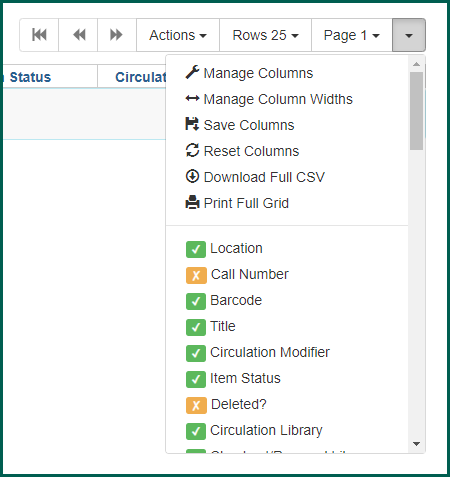
To add or remove columns, click on the column picker/grid manager button and click on the entries. An orange “x” indicates that a column is not in use. A green check mark indicates the column appears in the grid.
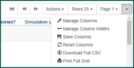
You can move and select/deselect columns using the Manage Columns option. Sortable interfaces also allow you to set primary sort columns rather than relying on the default Left-to-Right order.
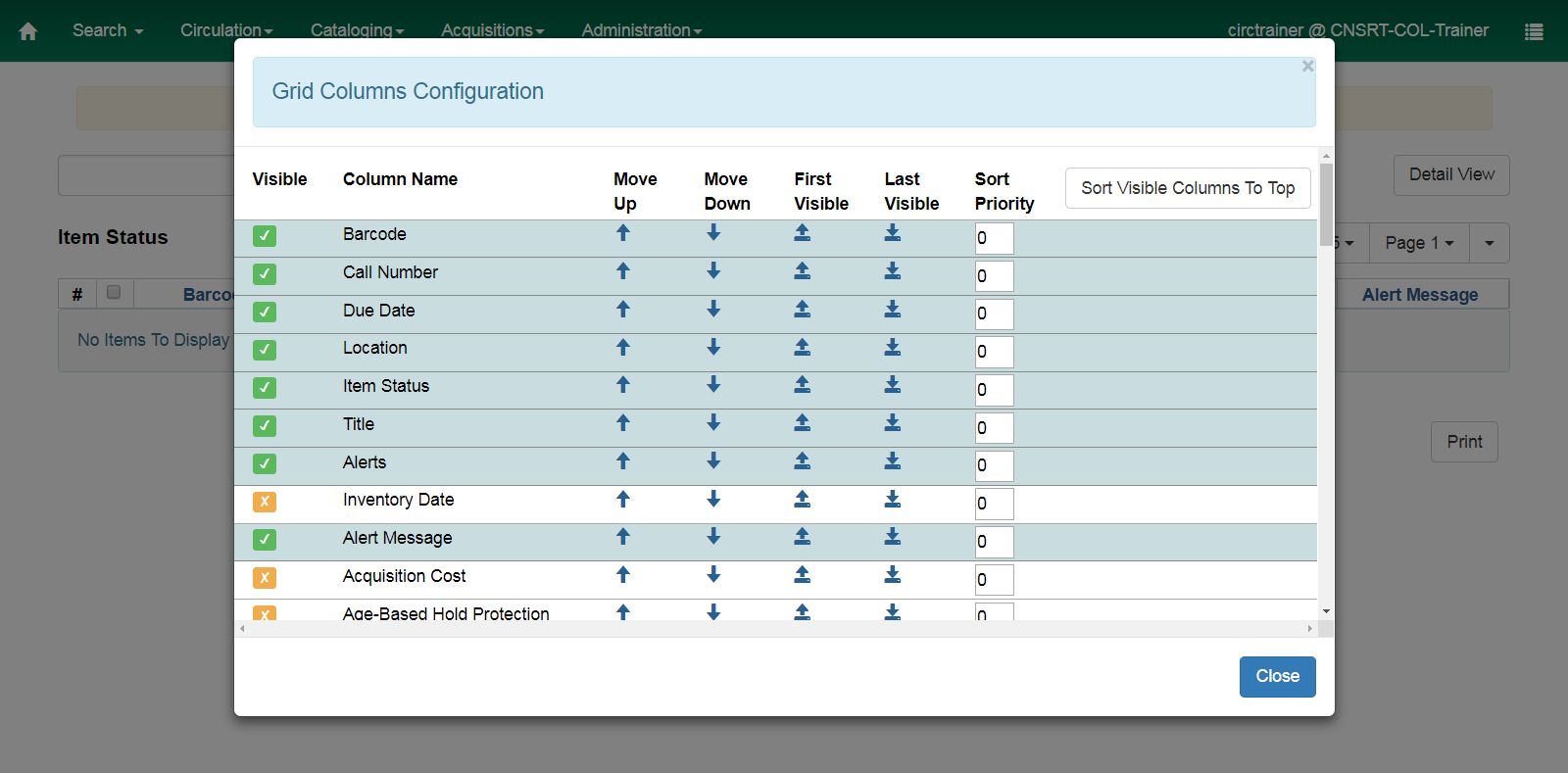
An orange “x” indicates that a column is not in use. A green check mark indicates the column appears in the grid. Use the up arrows to move a selected column to the left; down arrows move columns to the left. Sort priority may be set if you do not wish to sort on the default Left-to-Right order.
You can manage column widths using the Manage Column Widths option. Changes made here are relative, so widening one column narrows all of the others.
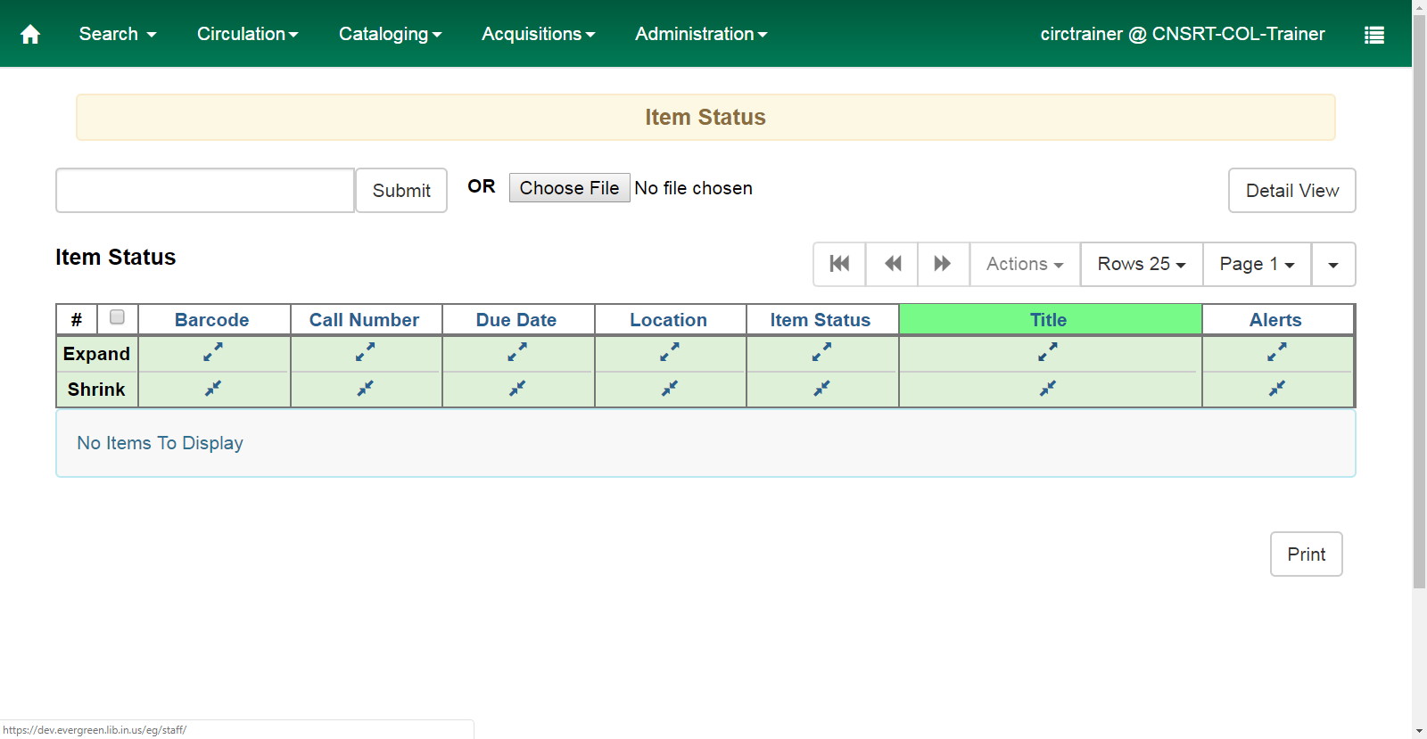
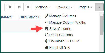
Use the Save Columns menu option to finalize your settings.
Rows #
Rows allows you to alter the number of visible rows on the screen without moving to a different page. Switching from a lower number to a higher number will reveal more items, but will slow the screen’s loading time if there are a lot of items or records being loaded.
If there are more rows than visibly selected, the arrow button will become active to switch between pages.
